VIMEO REBRAND
Over two decades of supporting independent filmmakers, Vimeo evolved. It grew tenfold, went public, and expanded into enterprise. Vimeo’s new identity reflects who it is today: a powerhouse platform supporting everyone from independent creatives to the world’s largest businesses.
Branding
Art Direction
Move Me
Our design system is anchored by a single idea: Move Me. It is the creative springboard that guides how Vimeo looks, sounds, and feels across every touchpoint. From business to product to brand, everything is designed to move people forward, simplify the video process, and leave audiences inspired by the power of video
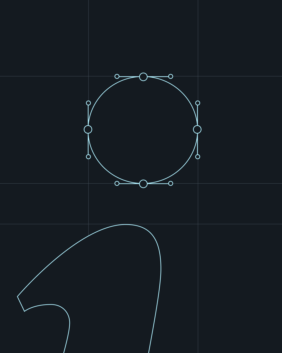

Originally designed by the founders, Vimeo’s logo remained unchanged for 20 years. Preserving that legacy was essential, so typographer Yomar Augusto refined the iconic mark while honoring its heritage.
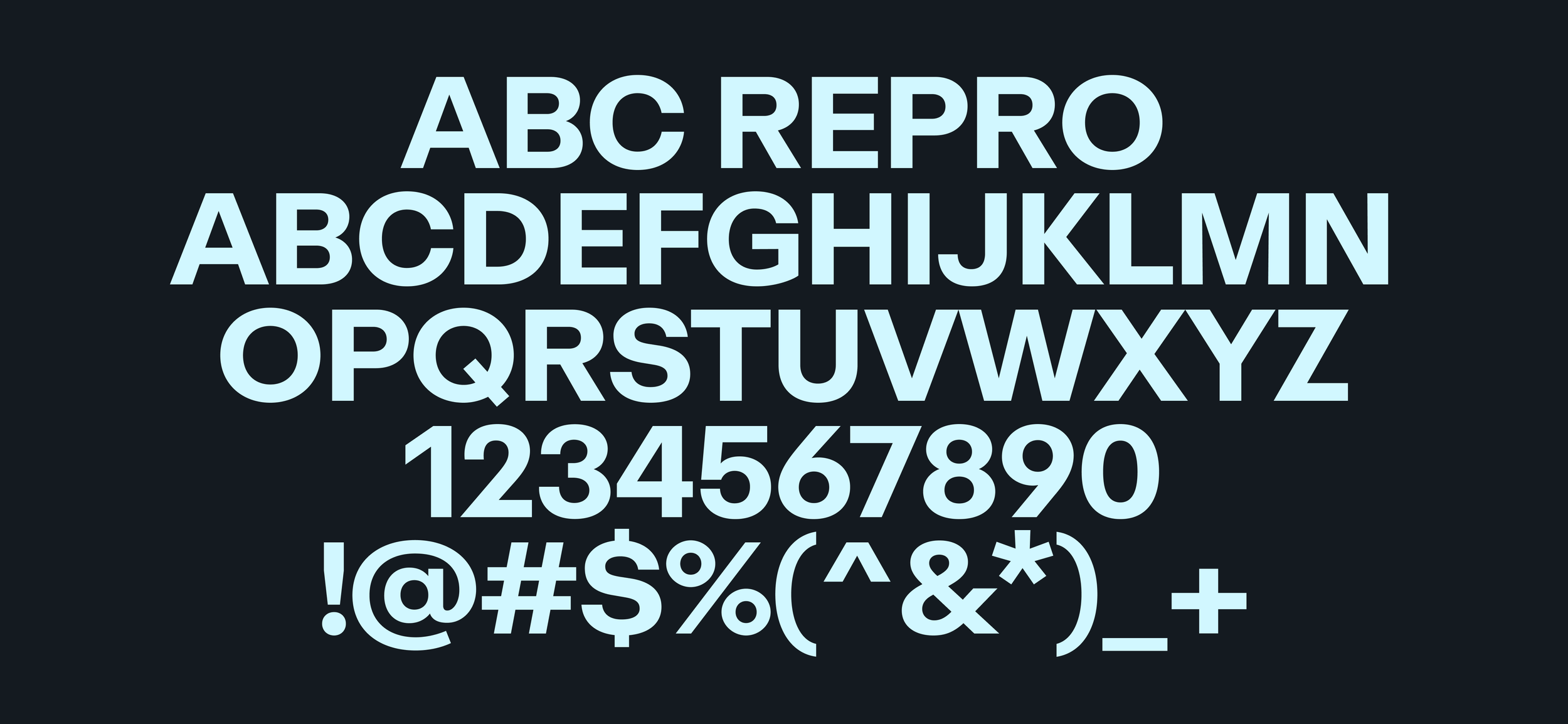
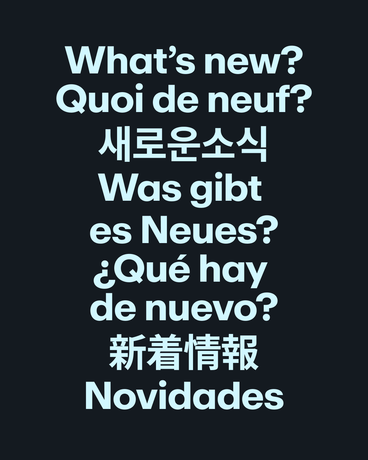
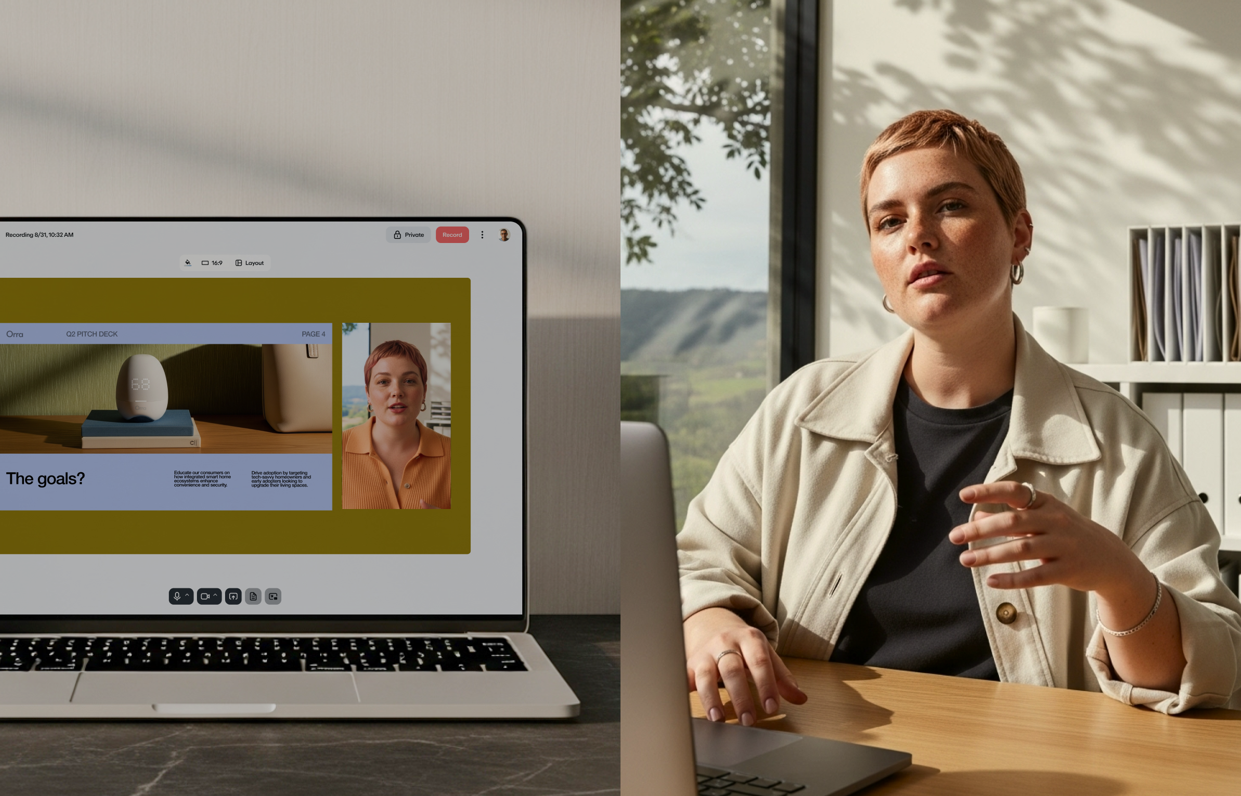
Vimeo’s new typeface, Repro, is friendly and flexible, designed to adapt seamlessly across multiple languages for a global brand.

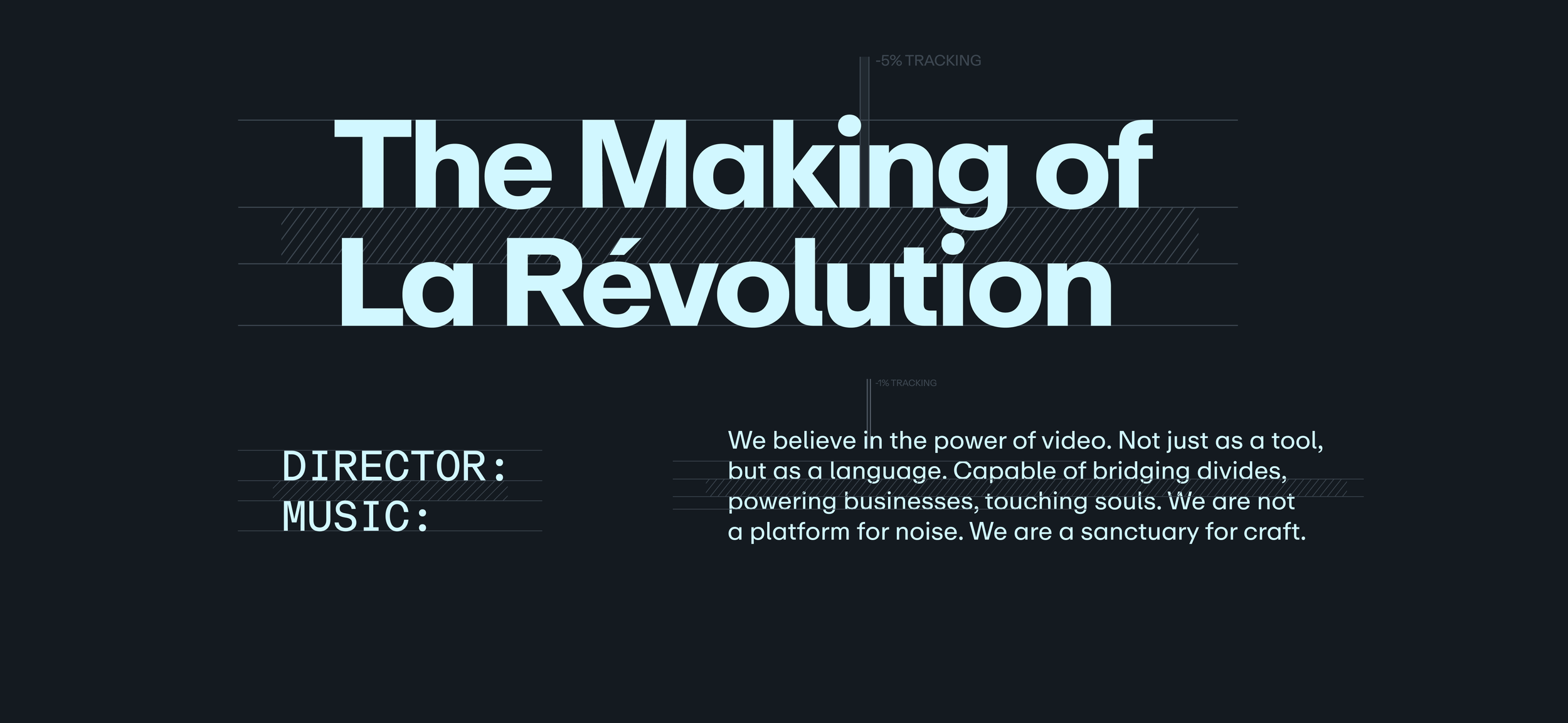
Many elements of the rebrand pay tribute to classic film: Repro Mono echoes traditional monospaced fonts from film scripts, while a three-column grid references the cinematic rule of thirds.

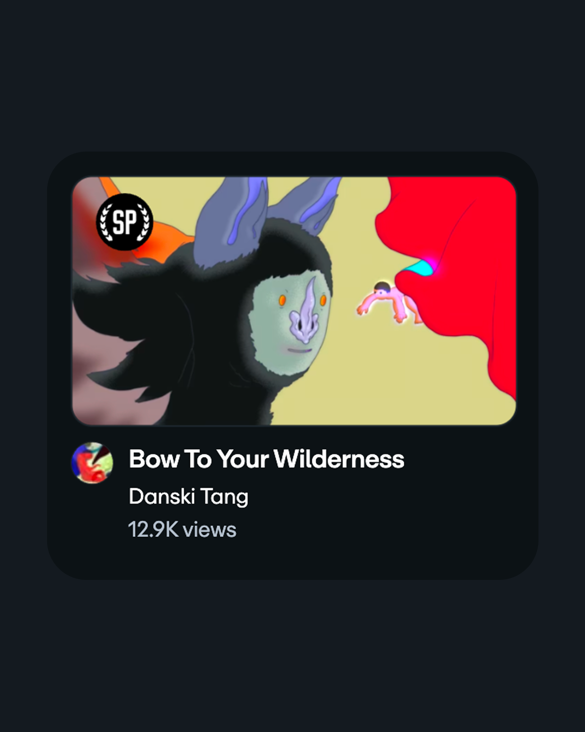
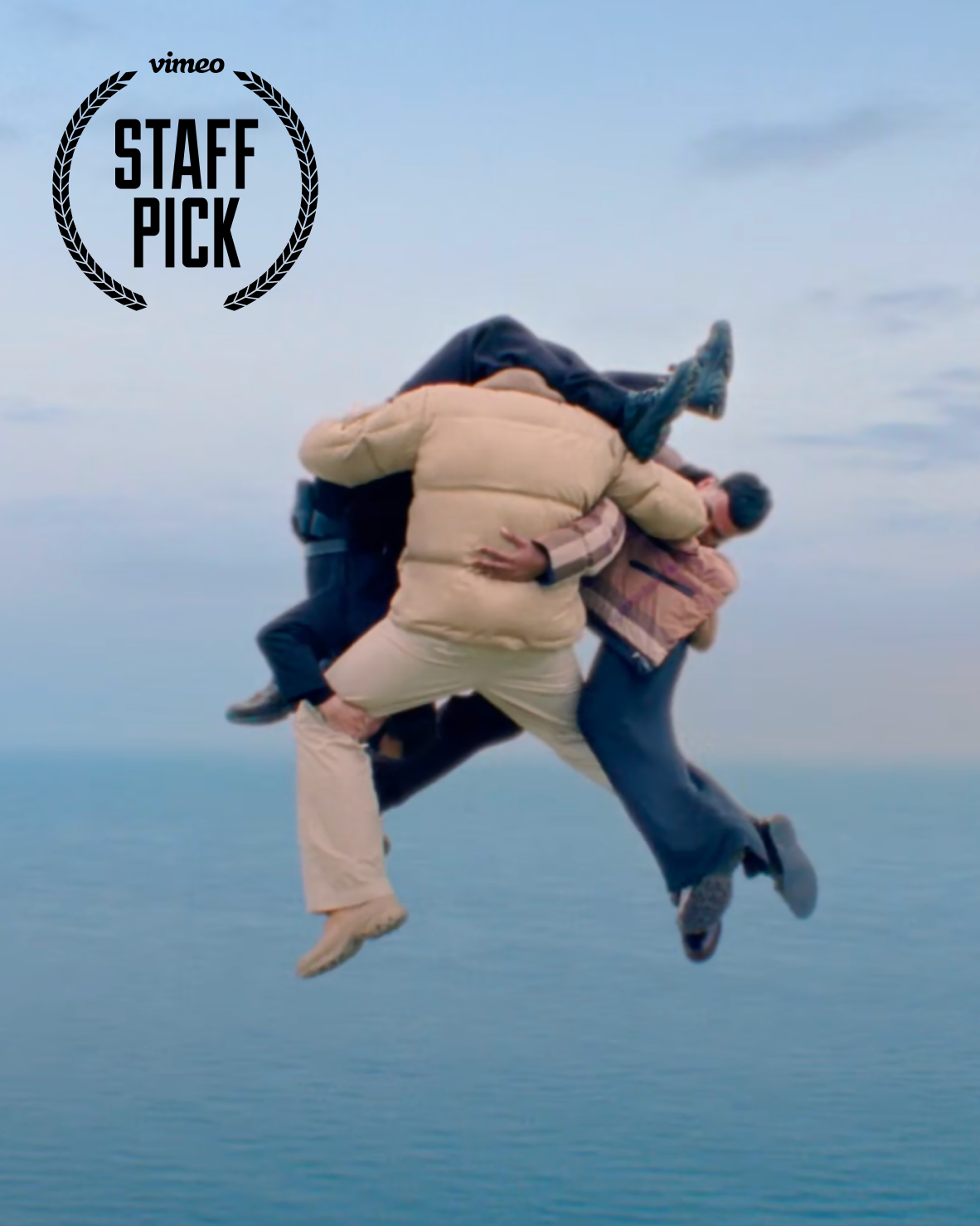
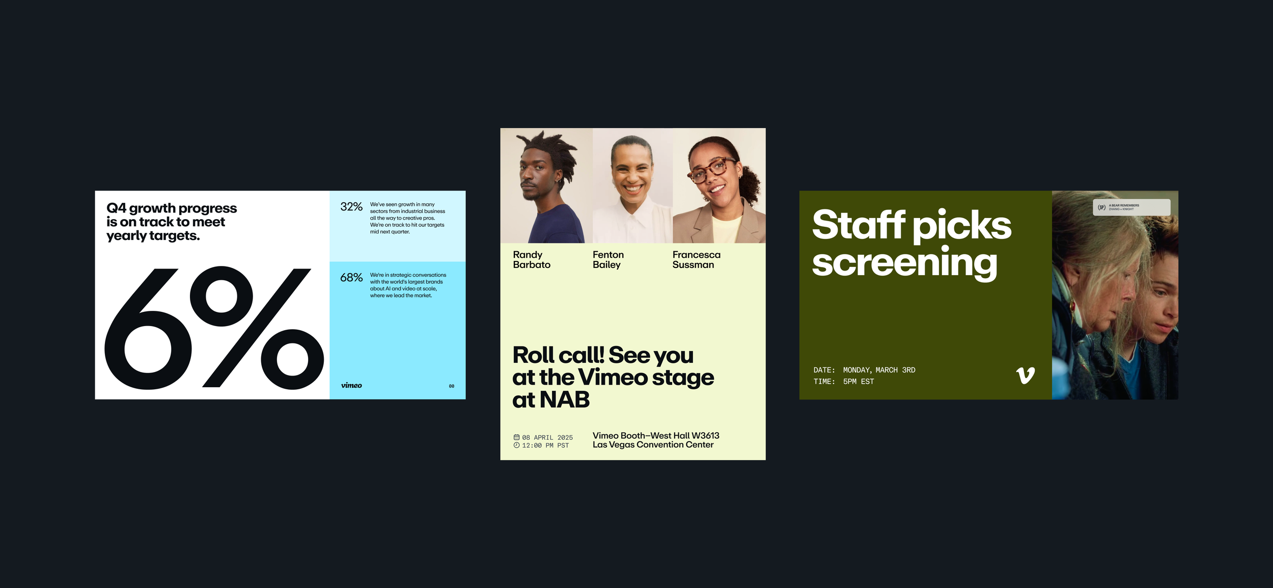
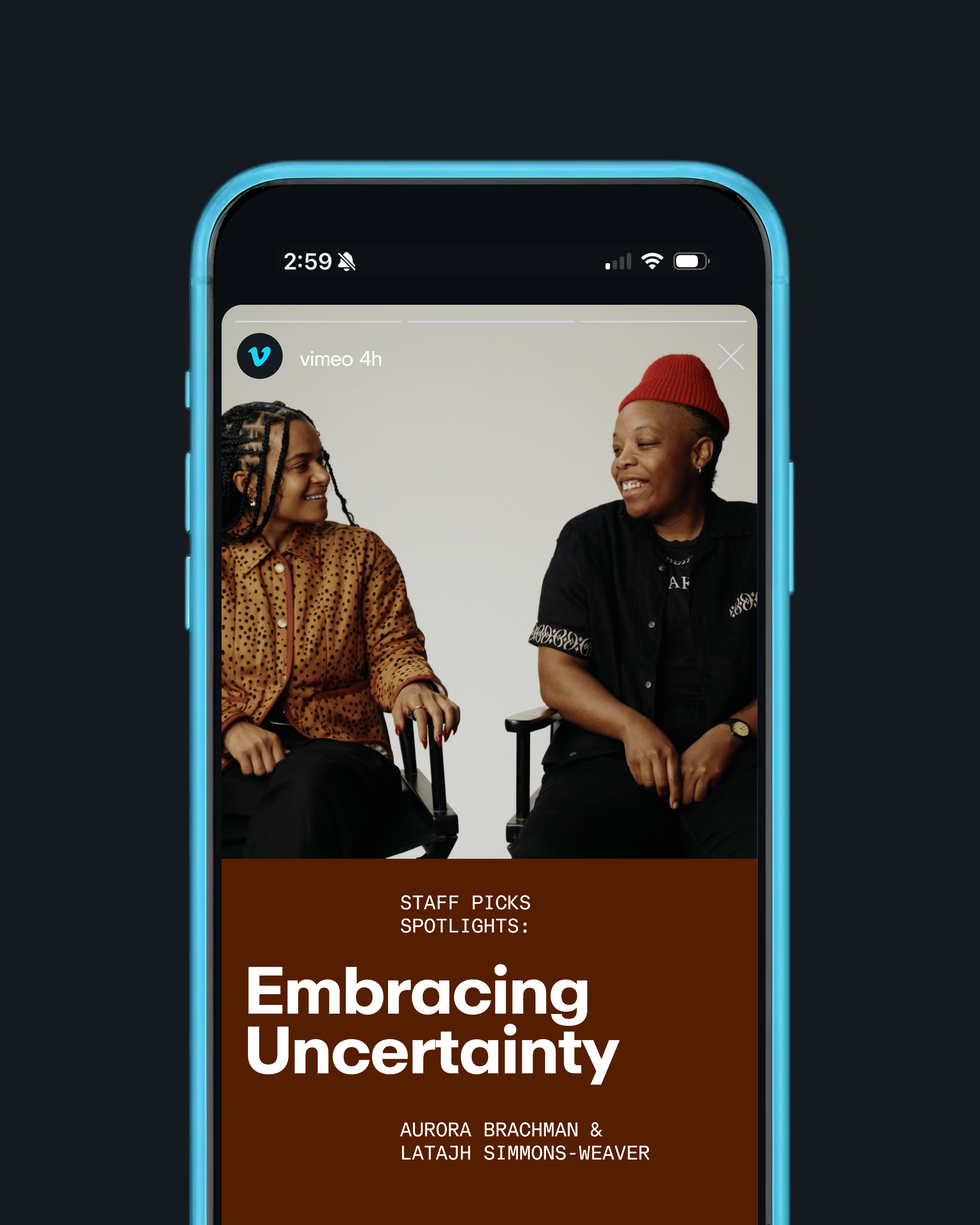
Staff Picks badges were updated to align with the new elements of the rebrand
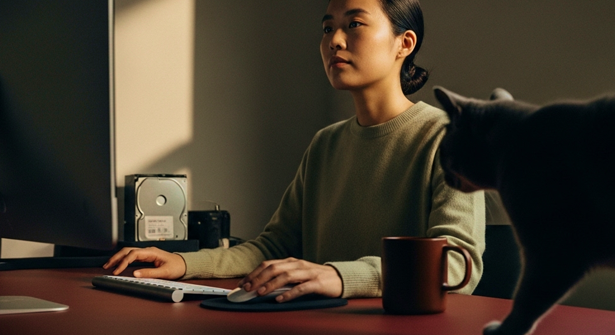
We established a more ownable photography style, elevating lifestyle imagery with cinematic realism


CMO: Charlie Ungashick
Creative Director: Bia Castro
Lead Brand Designer: Eden Shats
Lead Copywriter: Katie Knecht
Creative Operations Director: Chloe Saintil
Agency: Koto